It's blog hop day at Papertrey Ink. The inspiration photo is gorgeous, but that actually made it a very hard inspiration to live up to!

I couldn't decide if the dark colour was blue or grey - it depended what screen I was looking at it on, but Nichole's blurb said "pop of navy" so I went with blue.
I had a bit of a false start with this first card - I wanted to get a watercolour feel so stamped the flowers and leaves with archival ink and then watercoloured over the top with inktense pencils to soften the images but the colours just weren't working and the card then got too busy (when cards are going wrong I never quite know how to stop!)

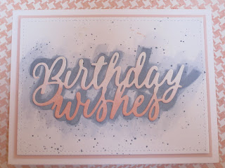
So I stepped back, and decided to go very simple instead. I used a die cut of the words to make a light embossed image on the card base and then watercoloured (again with inktense pencils) over the top, following the general shape of the letters. When this was dry I stuck the die cut over the top, having first sponged the bottom part in Pale peony ink.
 I like this one much better. now if only I can work out why my camera keeps taking photos with a hazy finish I'll be all set.
I couldn't decide if the dark colour was blue or grey - it depended what screen I was looking at it on, but Nichole's blurb said "pop of navy" so I went with blue.
I had a bit of a false start with this first card - I wanted to get a watercolour feel so stamped the flowers and leaves with archival ink and then watercoloured over the top with inktense pencils to soften the images but the colours just weren't working and the card then got too busy (when cards are going wrong I never quite know how to stop!)

So I stepped back, and decided to go very simple instead. I used a die cut of the words to make a light embossed image on the card base and then watercoloured (again with inktense pencils) over the top, following the general shape of the letters. When this was dry I stuck the die cut over the top, having first sponged the bottom part in Pale peony ink.

These are both so pretty!
ReplyDeletelove the shadow look you created on your 2nd card - both are very pretty designs!
ReplyDeleteI actually like both cards. I've not thought of using a "pop of navy", it works
ReplyDeleteI think both card are pretty, especially with the layers! And I love the navy in the first. Beautiful script on the 2nd.
ReplyDeleteGreat use of colors - I'm loving the floral images on the first one!
ReplyDelete